How do you reposition a gas station as a lifestyle stop rather than just a fueling point? The challenge was to craft an identity that feels welcoming, modern, clean, and purposeful while staying simple and highly recognizable across physical applications (signage, uniforms, packaging).
Date:
December 5, 2022

Brief:
Destination is a new concept for urban gas stations that goes beyond simply refueling. Designed as a modern, comfortable, and fast stopover for families, the station combines essential services with a café and small retail zone, transforming the traditional gas station into a destination and meeting point for city residents.
The branding needed to reflect this transformation: not just a pit stop, but a place you actively choose to go to.
Challenge:
How do you reposition a gas station as a lifestyle stop rather than just a fueling point?
The challenge was to craft an identity that feels welcoming, modern, clean, and purposeful while staying simple and highly recognizable across physical applications (signage, uniforms, packaging).
Insight:
Every journey has a starting point, a direction, and a destination. People seek convenient, welcoming, and efficient places that fit seamlessly into their urban routines—a reliable destination for any path they take.
Idea:
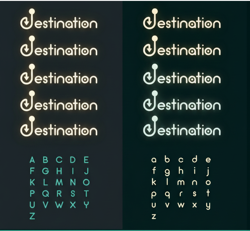
I built the logo around the letter “D” (for Destination) transformed into a map pin symbolizing both the start and end point of a journey.
The design starts with a circle at the top (the starting point) and flows into a path ending with an arrow (the destination). This fluid shape encapsulates the journey, movement, and direction—visually reinforcing the brand’s promise:
“Always Have a Destination.”
The typography was kept rounded, clean, and geometric to evoke friendliness and accessibility, while the color palette (a fresh, modern green) emphasizes sustainability, energy, and a refreshing urban vibe.
Execution:
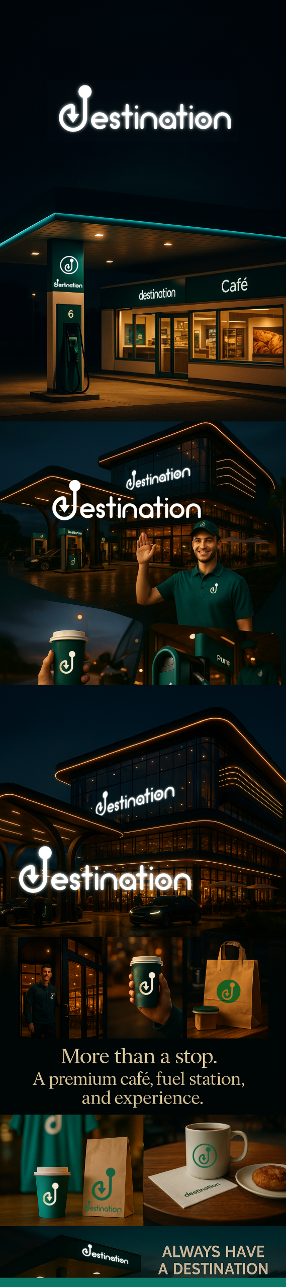
Logo and icon system adaptable across signage, merchandise, and digital platforms.
Full stationery and packaging applications (uniforms, takeaway cups, shopping bags).
Gas station exterior branding (canopy, pumps, café facade, fuel price pillars).
Tagline and supporting visuals emphasizing movement and destination.
Result:
The brand successfully transforms the perception of a gas station into a convenient urban destination for families and individuals alike, blending functionality with a welcoming environment.
(Note: this project was a branding concept and has not been physically implemented yet.)
Destination is a new concept for urban gas stations that goes beyond simply refueling. Designed as a modern, comfortable, and fast stopover for families, the station combines essential services with a café and small retail zone, transforming the traditional gas station into a destination and meeting point for city residents.
The branding needed to reflect this transformation: not just a pit stop, but a place you actively choose to go to.
Challenge:
How do you reposition a gas station as a lifestyle stop rather than just a fueling point?
The challenge was to craft an identity that feels welcoming, modern, clean, and purposeful while staying simple and highly recognizable across physical applications (signage, uniforms, packaging).
Insight:
Every journey has a starting point, a direction, and a destination. People seek convenient, welcoming, and efficient places that fit seamlessly into their urban routines—a reliable destination for any path they take.
Idea:
I built the logo around the letter “D” (for Destination) transformed into a map pin symbolizing both the start and end point of a journey.
The design starts with a circle at the top (the starting point) and flows into a path ending with an arrow (the destination). This fluid shape encapsulates the journey, movement, and direction—visually reinforcing the brand’s promise:
“Always Have a Destination.”
The typography was kept rounded, clean, and geometric to evoke friendliness and accessibility, while the color palette (a fresh, modern green) emphasizes sustainability, energy, and a refreshing urban vibe.
Execution:
Logo and icon system adaptable across signage, merchandise, and digital platforms.
Full stationery and packaging applications (uniforms, takeaway cups, shopping bags).
Gas station exterior branding (canopy, pumps, café facade, fuel price pillars).
Tagline and supporting visuals emphasizing movement and destination.
Result:
The brand successfully transforms the perception of a gas station into a convenient urban destination for families and individuals alike, blending functionality with a welcoming environment.
(Note: this project was a branding concept and has not been physically implemented yet.)