MgaicHairCare
Date:
February 11, 2017
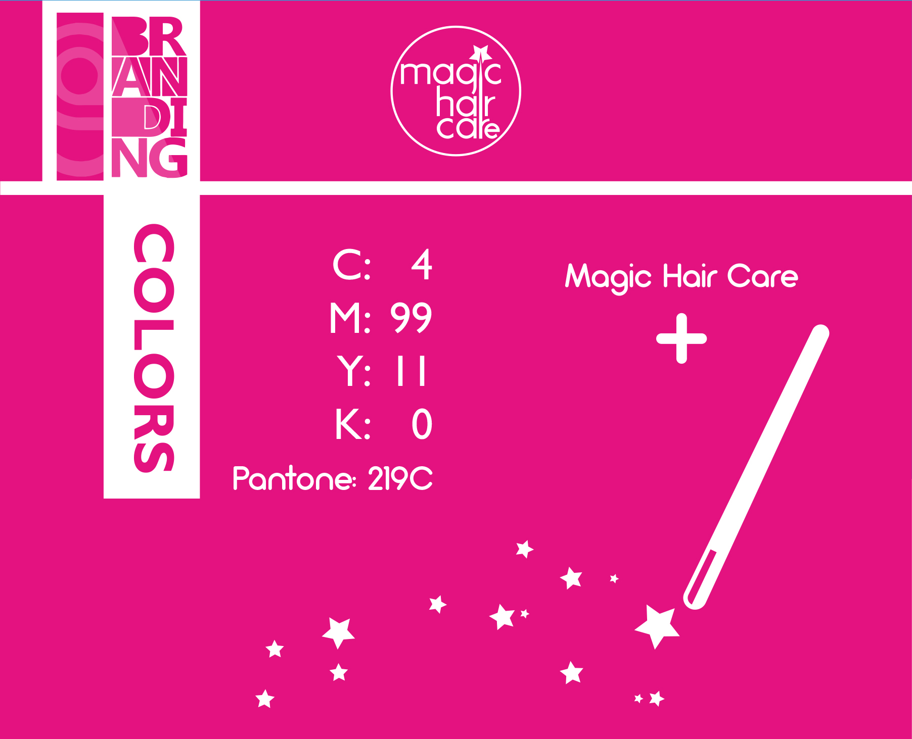
The Challenge: Creating a premium visual identity for Mgaic Hair Care, a professional haircare brand. The objective was to find the perfect synergy between the concept of “Magic” (instant, transformative results) and “Professionalism” (pure, high-end care), ensuring the brand stands out with a sophisticated edge.
2. The Creative Concept: The artistic vision was built on the philosophy of “Structured Magic.” I developed a custom typographic system where the letter (i) acts as the focal point. The dot of the (i) was reimagined as a star to symbolize brilliance, while the stem of the letter extends to subtly form a Magic Wand. To complete the composition, the entire logotype is housed within a circular frame. This circle represents Containment and Wholeness, unifying the brand’s elements into a single, focused mark that conveys trust, quality, and a holistic approach to beauty.
3. My Role:
Art Direction: Defining the brand’s aesthetic language as Minimalist yet high-impact.
Custom Typography & Iconography: Engineering the visual metaphors (Star, Wand, Circle) to seamlessly integrate with the brand name.
Packaging & Visual Identity: Designing sleek, earthy-toned packaging that reflects the organic and professional nature of the product.
4. The Outcome: A cohesive, storytelling-driven identity that positions Mgaic as an iconic, luxury haircare brand. The strategic use of geometry and symbolism resulted in a memorable visual language that resonates with premium consumers.
2. The Creative Concept: The artistic vision was built on the philosophy of “Structured Magic.” I developed a custom typographic system where the letter (i) acts as the focal point. The dot of the (i) was reimagined as a star to symbolize brilliance, while the stem of the letter extends to subtly form a Magic Wand. To complete the composition, the entire logotype is housed within a circular frame. This circle represents Containment and Wholeness, unifying the brand’s elements into a single, focused mark that conveys trust, quality, and a holistic approach to beauty.
3. My Role:
Art Direction: Defining the brand’s aesthetic language as Minimalist yet high-impact.
Custom Typography & Iconography: Engineering the visual metaphors (Star, Wand, Circle) to seamlessly integrate with the brand name.
Packaging & Visual Identity: Designing sleek, earthy-toned packaging that reflects the organic and professional nature of the product.
4. The Outcome: A cohesive, storytelling-driven identity that positions Mgaic as an iconic, luxury haircare brand. The strategic use of geometry and symbolism resulted in a memorable visual language that resonates with premium consumers.